Color & Palettes for Pixel Art Lesson 2 of 4
Value before hue
Readability comes from light-and-dark, not color. Prove it in grayscale.
Value is how light or dark a color is, independent of its hue. Readability — being able to tell shapes apart — comes almost entirely from value contrast, not from color. Two colors that look different in hue but have the same value will blend into an unreadable mush at small sizes.
The grayscale test
Desaturate your palette (or your sprite) to grayscale. If the shapes still read clearly, your values are working. If everything turns into one flat grey, your values are too close together — spread them out before worrying about hue.
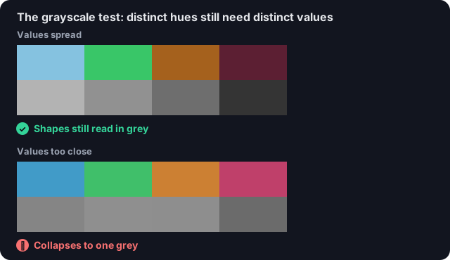
Distinct hues are not enough: only spread-out values (top) survive the grayscale test.
Quick check
If a sprite becomes an unreadable grey blob in the grayscale test, the problem is: