Color and limited palettes
Value first, then hue-shift. Why fewer colors look better.
Great pixel art usually uses a small, deliberate palette — often 8 to 32 colors for a whole scene. A limited palette forces cohesion: colors relate to each other instead of fighting. It is also faster to work with and reads more clearly at small sizes.
Value before hue
Value is how light or dark a color is. Readability comes from value contrast, not from color. A good test: if you desaturate your sprite to grayscale, can you still tell the shapes apart? If yes, your values are working.
Hue-shifting
When you make a color darker for shadow, do not just lower its brightness. Shift the hue too — push shadows toward cooler hues (blue/purple) and highlights toward warmer hues (yellow/orange). Hue-shifting is the single biggest upgrade from "flat and muddy" to "vibrant and professional."
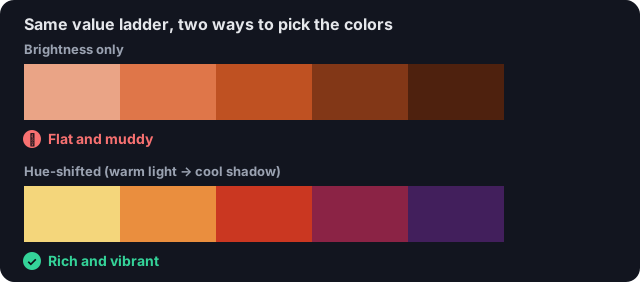
You darken a color for a shadow. What should you also do?